- Stay Connected
Socialize

 Abraham Lincoln
If given the truth, the people can be depended upon to meet any national crisis...
Abraham Lincoln
If given the truth, the people can be depended upon to meet any national crisis...

 Guildford news...
for Guildford people, brought to you by Guildford reporters - Guildford's own news service
Guildford news...
for Guildford people, brought to you by Guildford reporters - Guildford's own news service
Retired Artist Who Wore His Heart On His Album Sleeves
Published on: 6 Aug, 2012
Updated on: 20 Aug, 2012

David Dragon with a copy of the album Sorcerers, by a band called Jan Dukes De Gray. This was the first sleeve he had a complete free hand in its design.
The artwork on an album sleeve is sometimes just as important as the music on the recording itself. A good design may do wonders for sales of the album while also helping to convey by way of imagery what the music is about and something of the musicians themselves.
Here, Guildford writer John Silke chats to David Dragon, a retired album sleeve artwork designer also from Guildford, who worked for Decca and EMI and designed album and DVD sleeves for artists such as UB40, XTC and Oasis.
JS: Okay, first off. David Dragon. Sounds like the perfect name for an album cover artist. Is it your real name?
DD: Yeah, it is my real name. It’s one of those things, because I’ve always had it, I don’t think about it. Occasionally, especially in America, I’ll tell people my name and they say: ‘Wow, what a great name”, and talk about it for ten minutes. To me it’s just my name, I don’t associate it with dragons or anything.
JS: Where did you study?
DD: I grew up in Southampton, so I started off there on what would now be a foundation course. We called it a pre-diploma course. Then I went to Canterbury where I stayed for three years, leaving in 1968.
JS: Did you get to experience any of the Canterbury music scene at that time?
DD: Yes, in fact Robert Wyatt was our life model. He was the drummer in a band called the Wildflowers. They used to play at all the college dances and stuff. Robert was a really interesting guy. He had a pair of shoes and he painted flowers on them I remember.
He used to come in and sit for us in our life model class. He was a really well read, interesting, Bohemian sort of guy. His mother was a very Bohemian woman. So he was sort of grounded in lots of culture, he could talk about any subject.
I remember the day he came in and said, I won’t be here anymore, I’m off to London to make my fortune.
JS: Which record labels did you work for and when?
DD: I started off at Decca. I was there for four years. Then I saw a job advertised at EMI. They were setting up a new cover and publicity dept. I was at EMI for a total of eight years, but in many different buildings, studios and circumstances. Then I left there in’81 and went freelance, working with another designer, Ken Ansell. That’s when I started working on bands like XTC and UB40, as Ken was doing a lot of work for Virgin.

The cover of Growers of Mushroom by Leaf Hound.
JS: I understand you created the cover for Leaf Hound’s album Growers of Mushroom.
DD: Growers of Mushroom Leaf hound yeah, I did that at Decca. What would happen is that the jobs were handed out. We had a really sergeant major kind of figure, who was the boss. He was a bit like Fulton Mackay without the Scottish accent. He ran our studio like Mackay ran the prison in Porridge.
He’d hand out the job bag, in which you’d get a brief and all the bits that you needed. You’d read it. We had co-ordinators as well. You’d go and see the co-ordinator who was handling that album and you’d chat about it with them.
JS: Leaf Hound was one of those jobs?
DD: Yeah, as I remember, Leaf Hound was pretty free hand. I had a photograph of the band. I said to the co-ordinator how about an illustration, he said okay, the title was Growers of Mushroom and I sort of went from there.
JS: Would you listen to the album first to get an idea of the music?
DD: Not necessarily. You wouldn’t always have the album at that stage. Amazingly, the co-ordinator would have a record player but there was no record player in the studio. No music or anything. I think I knew it was a kind of heavy, Zeppelin type rock album.
JS: Did you talk to the band?
DD: No they weren’t English so I don’t think they were in the country. In many ways that made it easier. If the band weren’t around to see it, I was a bit freer to do what I wanted.
JS: How long did Leaf Hound take to do?
DD: It probably too me about a week, nine to five every day. It was a nine to five. No one stayed late, they would lock up at five thirty and kick you out. I came up with a rough sketch, show it to the co-ordinator, he said yep ok and off I went. Wasn’t always like that, sometimes you’d have to stick more rigidly to a set idea, but in that particular case it was pretty free
JS: Did you know that a copy of Growers of Mushroom has recently fetched an astonishing £4000?
DD: No I didn’t. Frustratingly, I had a first proof off, that’s a printer’s proof, of the sleeve, but I never had the LP. Frustrating to know that it’s gone for that much money.
JS: So you haven’t got a box of them under the bed?
DD: No I’m afraid I haven’t (laughs).
JS: What was your first cover?

Sleeve of the LP The World of Reginald Dixon. David Dragon did this design based on a standard format for The World of…. series issued by Decca.
DD: My first ever cover was for Decca’s World of series. They’d trawl someone’s back catalogue, compile some songs and release an album under the name The World of…. I did The World of Reginald Dixon. He played the tower organ in Blackpool. The design elements were all there, I just put it together basically.
But the first ever original album I did was called, Sorcerers by a band called Jan Dukes De Gray, who were a duo, Sort of like T-Rex were at the time. I got a completely free hand on that.
I remember talking to the producer of the record, a guy called David Hitchcock who was the star producer at Decca, I talked about an idea I had, to do a pen and ink drawing, just black and white, and then when it was printed it was printed on red and we picked out a few details in an acidy green colour, the printer just sort of dropped those colours in.
JS: You don’t have the original of that do you?
DD: No, no. That’s a big point actually, I’ve got very few original pieces, ’cause pre computer era, the original often went off to the printer because it would have to be scanned and more often than not you never saw the original again.So it was very rare to get the original back. It would be great to have everything I ever did but unfortunately I haven’t.
JS: Can you describe a typical day working in the art department of Decca? It can’t always have been creating fabulous cover art. Were there more mundane tasks?
DD: There were mundane tasks. We’d get a lot of American imports and you’d have to change things like the catalogue number and the spine. Essentially you’d take the sleeve, open it out, put an overlay on it and everything on the overlay would replace all the bits that had to be replaced. If you’d been naughty Ernest would come round and punish you with like eight remakes, as they were called. Really boring task.
There was quite a lot of competition for the plumb jobs. If you heard a plumb job was coming in you’d go up to the co-ordinator and say: “I hear you’ve got so and so coming in, I really fancy it.” And they’d say: “Ah funny you should come in, ’cause I’ve already had three other people in sniffing around for that one.”
The great thing would be was if the co-ordinator had shown one of the artists your work and they’d specifically ask for you, because then it bypassed Ernest. So it was about a fifty-fifty split between drudge and good stuff.
JS: There must have been some pretty tight deadlines at times. Do you have any memories of being up late working frantically by moonlight to finish some album artwork?
DD: Many many memories of that. It was busiest when I went freelance because you never said no to anything. At least at Decca if you were overloaded they would spread the work around.
When I was freelance there was only three of us. That was it. Particularly working for Virgin, we did a lot of twelve-inch singles for them. They would ring up usually around lunchtime and say we’ve got a twelve-inch single to do. They’d brief you over the phone, you wouldn’t even hear it. They’d say: “We want that in twenty four hours.” Sometimes you’d get a couple to do.
It was all done by hand, this was still pre-computer era. You’d devise shortcuts. The more you do of that sort of work the better and quicker you get at it. So yeah, many late nights and early mornings.

David Dragon with a copy of XTC’s Oranges and Lemons album. Its design harks back to the Beatles’ Yellow Submarine EP.
JS: I see artwork over there that looks very Yellow Submarine influenced, is that one of yours? Who is it?
DD: Yeah that was done for XTC, round about the time of that new summer of love in the late eighties. Andy Partridge and the band members had always been big Beatles fans, so it was their excuse to go back to that era and do a sleeve that showed that influence. Andy would always have at least the germ of an idea. He had a little book and he used to do his sketches in it. I used to go down to Swindon and sit in his kitchen and drink endless cups of tea and he used to make these huge wedge cheese sandwiches. I’d spend the day with him. I’d always come away with something. I’d go back to London, work on it and then go back to Andy’s and we’d take it from there.
JS: So that’s one sleeve where you kept the original artwork.
DD: Yeah, I did keep that one. We were a bit more in control as we had our own company by then, so you made sure you got it back.

Baddariddim by UB40.
JS: You did the Baggariddim cover for UB40. That must have been fun with its collage 3-D approach. Was that inspired by American artist Robert Rauschenberg?
DD: It was, I’ve always liked Robert Rauschenberg ever since college days. One of the band, Brian Travers, came down to London to talk about the sleeve, and we spent an hour or so chatting about it. He said it was a dub album and quite loose. I showed him some Robert Rauschenberg in a book, suggested something in that style and he said: “yeah fine”. I had about two weeks to do it. So two weeks later he came back and I’d finished it. Very rare to have complete freedom like that.
Then they got this new American manager. Luckily he came on board when it was too late for him to stop the Baggariddm album cover because he hated it, said it wasn’t commercial. But it wasn’t the most commercial of their albums. We also did the first Labour of Love in cut paper, which was quite quick.
JS: I believe one of your most celebrated covers is Wire’s Pink Flag, can you tell me about making that?

Pink Flag by the band Wire.
DD: Yes, I did that. The manager came in, had a chat, really nice guy and a couple of the band came in. They had a photograph of the flagpole. There was no flag on it. They described how they wanted a pink flag added to the flagpole, they just wanted a flat colour, not realistic so I hand drew it and airbrushed the sky blue as it was a black and white photograph and I laid out the back with the four pictures. That’s one of the highlights really being involved with them, ’cause I really liked them as well. I also worked on 154, which was their third album. They were great guys and I still play them.
JS: Did the CD era kill album artwork?
DD: When CDs came along, Ken and I were kind of, this is the end. Going from working on twelve inches square to something tiny, but amazingly you can do a piece of artwork quite large and reduce it down to really quite small and it holds the detail. Its not quite the same, you’d get a new LP and spend days pouring over every little detail, but of course with the CD you got a booklet, which was an added opportunity for a designer. And in fact you could charge a bit more for CDs cos they took longer to do. To be honest, you didn’t really get paid that much, it was always a bit of a squeeze to get the money out of them.
JS: Have you embraced digital technology, Photoshop and the like?
DD: A bit. What happened was we set up our own company and we got the first Mac, which was tiny. We’d occasionally go and fiddle with it for half an hour then get back on to the drawing board. The company started to grow and we employed new younger designers who were much more Mac savvy and they quickly overtook us. So in a way we never had to learn as we always had new people coming in who were better and quicker than us, so we’d just defer to them. We’d have an idea and they’d realise it. So I’ve only really got to grips with it once I retired and got my own Mac. I’ve done it really like most people by trial and error. I do get frustrated that I can’t do more. My sons are both designers and they come round, I ask them how to do something and they do it all really with shortcuts and I get lost. I have to write it all down.

DVD sleeve for Lord Don’t Let Me Down by Oasis.
JS: What was the last album artwork you did?
DD: The last music cover I did was for Oasis, the Lord Don’t Slow Me Down DVD. It was hand drawn. Noel Gallagher specifically wanted it not done on a computer. I mean it could have been really but I think Noel wanted to have the original artwork when it was finished,
JS: So are you completely retired from album artwork?
DD: Yeah, the company I was part of, Clinic, they still do some record work but its changed so much from the glory days, The zenith was really EMI in the 1970s. We used to have champagne receptions for virtually anything they released even singles, It was ridiculous, the amount of money they spent, completely pointless really in terms of promoting anything.
JS: Finally, where can the readers see your work?
DD: On my website thedragonboys.com. There’s a bit of album work on there and some of my recent work. I’m still quite active, painting and taking photographs.
This interview first appeared in John Silke’s Kindle book, Record Collecting in the Digital Age. Click here to see its listing on Amazon.
Share This Post


I'm living well for nothing at all! (See: No Trifling Matter: Magpie Trapped in Godalming Sainsbury’s)


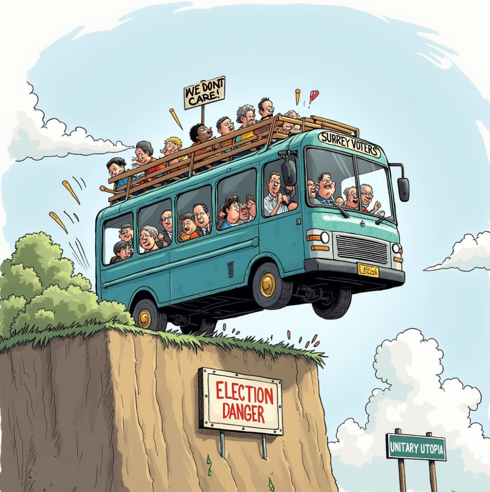
Next stop, Debt Chasm! (See: We Should All Be Outraged About the Failure to Deal with Legacy Debt)


Recent Comments