- Stay Connected

Socialize

 Abraham Lincoln
If given the truth, the people can be depended upon to meet any national crisis...
Abraham Lincoln
If given the truth, the people can be depended upon to meet any national crisis...

 Guildford news...
for Guildford people, brought to you by Guildford reporters - Guildford's own news service
Guildford news...
for Guildford people, brought to you by Guildford reporters - Guildford's own news service
How Will The New Waitrose Look And Why?
Published on: 19 Nov, 2012
Updated on: 19 Nov, 2012

View from Haydon Place (click on image to enlarge)
Guildford will be getting a new Waitrose store, subject to final approval by Eric Pickles, the relevant the Secretary of State for Communities and Local Government. But what will it look like and why?
Here we bring you an extended range of projected images of the new building, together with some of the three main materials that have been selected. All images have been kindly provided by Guildford Borough Council (GBC).
The text has all been extracted from the notes that were in the notes for attendees provided for the GBC planning committee meeting.
“The architectural approach used in the development proposal
“The supermarket is a difficult building type to design in a sensitive way. The large floor plan and operational requirements mean that there is limited scope to design anything much beyond a large box. It is often not appropriate to design supermarkets in a traditional vernacular. The size of the building means that the use of a traditional architectural language is inappropriate and the resultant building rarely satisfactory in design terms. There are many examples all over the country that bear testimony to the failed attempts to design a traditional supermarket that use false pitch roofs wrapped around large flat roofs and bland brick elevations with large glass panels that do not provide robust architecture up or a stimulating street scene, such as the modern development proposed here.

View from junction of College Road and Leapale Lane (click on image to enlarge).
“The approach proposed in this application is a modern one that responds to the demands of the building and its operational requirements. It is a bold design that does not seek to replicate the buildings within its wider setting but does respond to the established context. The use of the sloping roof line means that the building can reflect the taller larger scale buildings on the corner of College Road and Leapale Lane while sloping down to a reduced right on the corner of Haydon Place and Leapale Lane.

View from College Road (click on image to enlarge).
“This device is also proposed on the College Road elevation where the dramatic sloping roof seeks to respond to the smaller houses in the existing terrace. At its junction with the row of terraced houses, the proposed building incorporates a glass balcony screen around the small roof garden. This section of the design is a good example of how this large building responds to and reflects the character of its surroundings. The height of the proposed new building is comparable to the terraced housing at this point and the junction between the new building and the existing terrace is further tempered by the use of the glass screen around the small roof garden. The sloping roof lines serve a practical purpose in that they allow the scale of the proposed building to respond to the immediate setting, but the use of the sloping roof line also means that an attractive pattern of storey heights and glazing pattern can be created with a rather abstract juxtaposition of parallel and sloping lines incorporated into the elevations. The shape and form of the roof also means that gardens can be incorporated into the roof plan of the building and glimpses of these gardens would be possible by the glazed panels along the top of the elevation to give an unexpected drama in the street scene as well as amenity space the future residents.
“The design solution is an unashamedly modern one but it is considered that it is an elegant building and one which is successful when viewed from all sides. The cream walls would be punctuated with deep windows and recess balconies and the silhouette of the building softened by a modern interpretation of crenellations in the form of glazed panels set into the top of the elevation. The façade is articulated and given texture with deep recesses which form balconies and windows. The upper floors would oversail the ground floor to give a crisp definition to the food store and the service areas and energy centre. There are pleasing details such as the treatments to the underside of the overhang which is repeated on the underside of the balconies in order to pull together all the components and form a cohesive design.

Blackston split faced masonry (typo above is as on image supplied).
“A pallet of three materials is proposed for the main building, which is mirrored on the other buildings to provide a sense of unity and cohesion. A rough textured dark grey stone is proposed for the ground floor, with a smooth textured large format fibre cement panel system in a cream colour as the main material.
")
Western red cedar.
“Red cedar wood is proposed that the soffits of the windows and under the canopy to soften the building and provide interest. Slate is proposed on the roots of the townhouses to tie them back into the residential context of Haydon Place, while the Beverley Hall extension is consistent with the use of materials used on the main building, with a vertical glass break separating the existing building from the extension.

Cream white fibre cement panels.
“The dark grey textured stone proposed for the shop front to the food store underground floors to the rest of the building is offset by the light colours used in the majority of the elevations. The light from the food store windows and the other lighting proposed for the building [on?] this material would actually be an attractive foil to the rest of the design and give interest and texture to the ground floor treatments.

View from junction of Leapale Lane & Haydon Place (click on image to enlarge).
“The design of the proposed houses along Haydon Place is an interesting solution to a difficult site. The prevailing character of the section of Haydon place is that every traditional Victorian street of small-scale buildings, punctuated with some taller buildings but most have an narrow plot with and untraditional in form.

“The design of the proposed new houses is therefore a modern interpretation of the traditional terrace house and has a traditional form with a pitch roof and a tall narrow frontage that is expressed in a modern architectural language using modern materials and an innovative glazing pattern that further emphasising the elegant vertical lines of the building.

View of Beverley Hall from Haydon Place.
“The extension to the Beverley Hall is a well mannered and gentled addition that replicates the forms and shapes of the existing buildings. The elevational treatment is modern[,] however it has been designed to reflect the traditional forms of the existing buildings and would reflect the architectural language of the food store building and the proposed new housing along Haydon Place, pulling together all the elements of the development of the site.
“Urban design and public realm
“As with the form of the building and the architectural detailing, the urban design of the proposal is a clever and sensitive response to the existing streetscape and urban context.
“The large communal courtyard/amenity space within the main building would be accessible to all the residents of the apartments, providing valuable space for the residents as well as creating an interesting designed space within the building.
“The most sensitive part of the site, in terms of the immediate impact of the proposal, is along Haydon Place. Here design has been developed to reflect the grain and proportions of the terraces along the road. The proposed building is set back from the road to create a public space and a further buffer between the houses and the proposed building and the resultant open spaces is designed to link the new building and the existing terrace through the use of paving and linear planting beds with small trees. The materials used in the public spaces are carried through the whole site to ensure continuity on the hard landscaping. The boundary treatments are proposed to be part hedging to soften the appearance and part solid walling to match the treatments on the surrounding buildings.

View from The Bars (click on image to enlarge).
“Impact on the conservation area and it’s setting
“Only a small part of the site, the Beverley Hall, is within the Town Centre Conservation Area. The retention, extension and refurbishment of Beverley Hall is considered to be an enhancement to the conservation area. The boundary of the conservation area runs along the side boundary adjacent to Haydon Place north to the junction with Sandfield Terrace, therefore the issue of the impact on the setting of the conservation area must also be addressed. The character of this part of the adjacent conservation area is mixed and includes the large commercial buildings at the north end of North Street as well as the finely grained areas of Victorian housing in Sandfield Terrace, Martyr Road and The Bars. As set out above, it is considered that the modern design is appropriate and blend successfully with his established character and appearance of the area. The proposal responds to the contrasting urban form that surrounds the site from the large commercial buildings to the south to the fine-grained small houses and shops along Haydon Place and in this respect the proposed development would not harm the setting of the conservation area at all but rather complete complements the area. The buildings on the site at present, apart from Beverley Hall are mixed character and quality and do not contribute to the character or appearance of the area.
“The proposal is a bold and innovative approach to the development of this site however it is considered that this proposal does still respond to the existing character and context of this part of the town centre. The proposal will enhance the character and appearance of the conservation area and its setting and will contribute to the vitality and civic life of the town in accordance with policies G5, HE7 and HE10 of the saved local plan.”
What do you think of the design, style and appearance? Please use the ‘Leave a Reply’ box below to give your opinion.

Share This Post


Responses to How Will The New Waitrose Look And Why?
Leave a Comment Please see our comments policy. All comments are moderated and may take time to appear. Full names, or at least initial and surname, must be given.
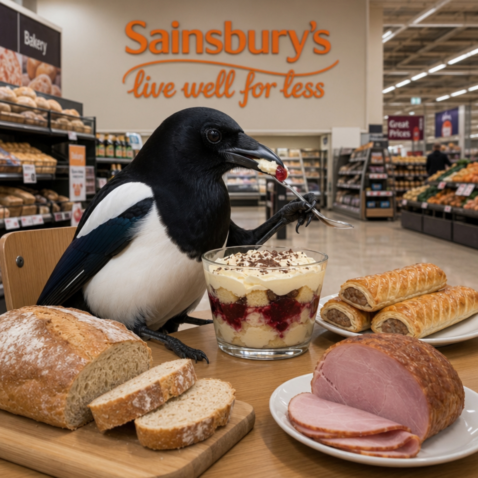
I'm living well for nothing at all! (See: No Trifling Matter: Magpie Trapped in Godalming Sainsbury’s)


Next stop, Debt Chasm! (See: We Should All Be Outraged About the Failure to Deal with Legacy Debt)


Bernard Parke
November 19, 2012 at 7:39 am
Let us hope that sanity will prevail!
A Oliver
November 20, 2012 at 12:00 pm
What an eyesore!
Lazy architecture at it’s very best…
Peter Walker
November 13, 2013 at 5:52 pm
A great improvement.
darren power
October 18, 2014 at 4:43 am
i think this will make guildford the best it been in years and it good to have watrose.
Bernard Parke
October 20, 2014 at 8:36 am
Yes, it will work wonders for Guildford’s congested traffic!
Bibhas Neogi
October 29, 2014 at 10:10 am
Right turn into and out of Waitrose would likely to cause further problems and these might have to be barred during peak hours to reduce restriction of flows both in eastbound York Road (it still remains a single lane before widening up near Waitrose entrance)and exit from Waitrose itself that is also a single lane to start with.
Jan Todd
October 30, 2014 at 7:48 am
OR, customers could WALK. Recent studies have shown that shopping habits are changing. Customers are shunning out-of-town stores in favour of smaller stores and shopping little and often. This reduces food waste as shoppers buy on a need-to-have basis. A decent town centre supermarket which we can walk to should be a real bonus to many who live and work in the town centre and do not own a car. My wheelie shopping bag is ready and waiting.
Barrie Davis
April 15, 2015 at 3:00 pm
Yuck. I think it looks horrible. It completely swamps the neat Victorian houses that abut.
I am surprised, shocked even, that Waitrose, of all people, would put up such an eyesore. It seems to be an experiment in just how nasty they could make it, and still get permission.
Jim Allen
April 16, 2015 at 11:17 am
The description reads like something out of a fantasy text book written by a wordsmith with nothing better to do with his time.
We should be thinking as human beings concerned with other human beings not with design and playing with words and pretty pictures.
We have lost the underpass used by children going to the local school. It has been replaced by a crossing over several complicated lanes of traffic.
What on earth were they thinking? It is designed as if the majority of children will be going away from the school not towards it.
The design is very poorly thought out. The pedestrian crossing should be closer to the school so that the children do not have to ‘double cross’ moving traffic and the car park entrance and all traffic should be stopped when children are crossing. Their road safety should not be a lottery.
Very concerned they only time the designers of the crossing will sit up and think rationally is when a school child is injured.
James Gross
April 18, 2015 at 12:00 am
Noting Jim Allen’s comments, it’s worth observing that the temporary pedestrian crossing that has been set up on the direct alignment of Stoke Fields and Haydon Place does allow for a very simple and safe crossing of York Road, at the narrowest points where these two historic streets connect.
I recall making this point to Waitrose and their consultants at one of their exhibitions, and queried why this was not chosen as the permanent location of the new crossing, but my comments were not taken on board.
If the temporary crossing is proving a safe and quick route, and the shortest link between two existing streets, surely common sense suggest the smart thing to do would be to make this permanent and give priority to pedestrians, especially school children and not traffic?