- Stay Connected
Socialize

 Abraham Lincoln
If given the truth, the people can be depended upon to meet any national crisis...
Abraham Lincoln
If given the truth, the people can be depended upon to meet any national crisis...

 Guildford news...
for Guildford people, brought to you by Guildford reporters - Guildford's own news service
Guildford news...
for Guildford people, brought to you by Guildford reporters - Guildford's own news service
New Borough Flag For Guildford
Published on: 5 Mar, 2015
Updated on: 6 Mar, 2015
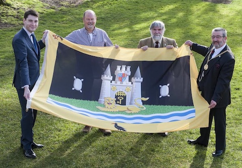
New new flag for Guildford Borough. On the left is Cllr Matt Furniss, next him is designer Graham Foster, borough remembrancer Matthew Alexander and Mayor David Elms.
Guildford borough now has an official flag.
The design is a rectangular version of its coat of arms was added a yellow border and the three Cornish choughs of the Onslow family, taken from the Rural District’s arms.
Those responsible at the borough council hope that the new flag makes a striking design, with its bright colours and symbols relevant to the town and the wider borough. The castle is represented, although as in the borough arms rather inaccurately and woolsacks, representing the commodity on which the town’s wealth in the middle ages was largely founded.
The current borough arms were granted in 1975 after the old Guildford Borough Council was combined with the Guildford Rural District Council as part of the local government reorganisation. The new flag can be seen flying at Millmead council offices.
Share This Post


Responses to New Borough Flag For Guildford
Leave a Comment Please see our comments policy. All comments are moderated and may take time to appear. Full names, or at least initial and surname, must be given.
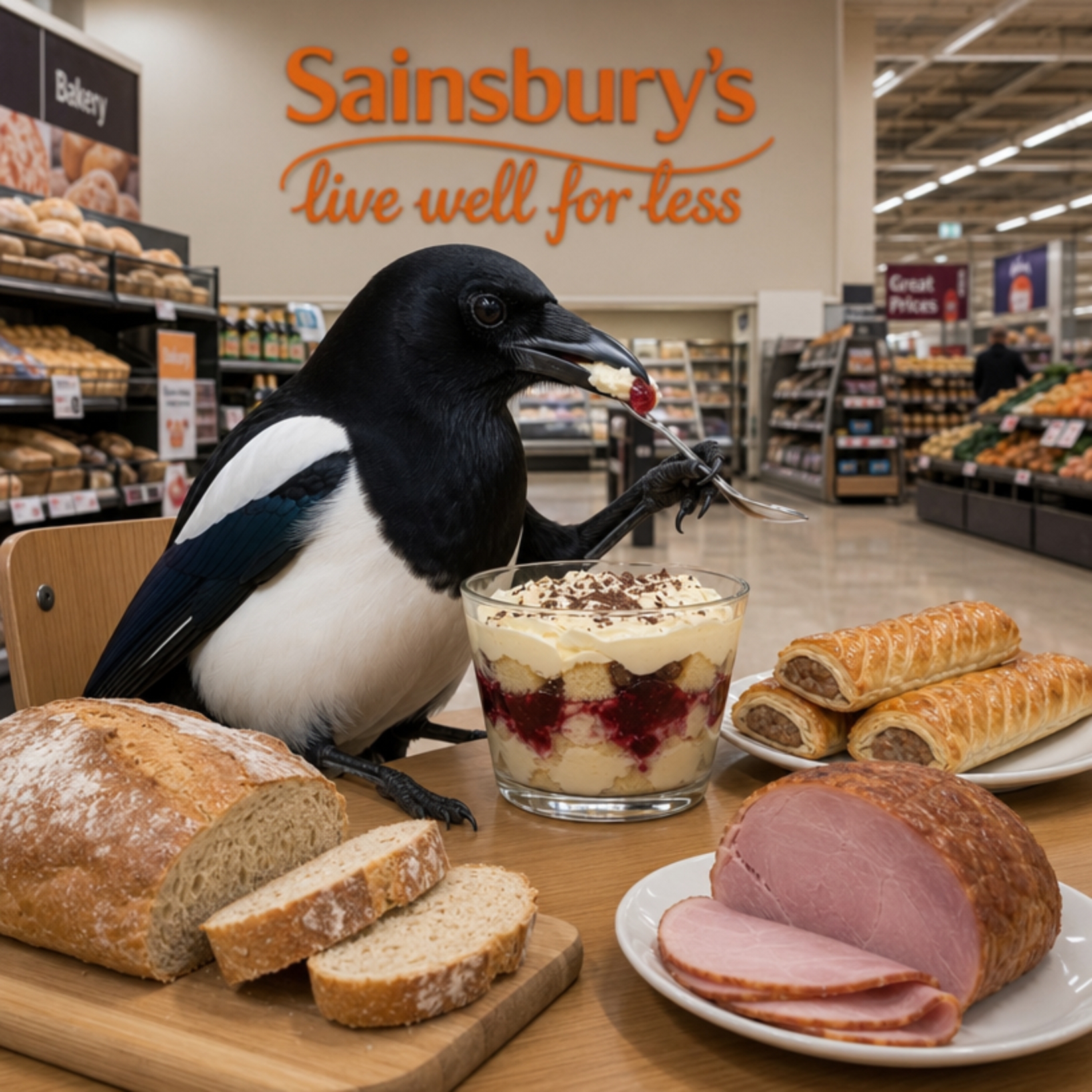
I'm living well for nothing at all! (See: No Trifling Matter: Magpie Trapped in Godalming Sainsbury’s)


Next stop, Debt Chasm! (See: We Should All Be Outraged About the Failure to Deal with Legacy Debt)


Bernard Parke
March 5, 2015 at 5:05 pm
The woolsacks are shown as Guildford once had a flourishing woollen trade, which went into decline as the Guildfordians of those times were inclined to stretch the wool too much during processing and as a result it was liable to shrink.
Archbishop George Abbot tried to revive the trade by building a “manufactory” at the rear of Abbot’s Hospital in North Street.
Guildford was known for a unique broad cloth, perhaps the only sign of this trade left is Racks Close where the wool was processed.
Back in the 1980s it was held that the the Guildford arms shown in the picture was out dated and a competition was held to find a new corporate logo.
The logo which was selected shows the letter “G” with two lines running from the centre of the letter.
These were to represent the rivers Wey and the River Mole.
The cost of this project was a mere £9,000. No doubt our new borough flag has cost considerably more than that figure?
Harry Eve
March 5, 2015 at 6:02 pm
I don’t know much about heraldry, but it is good to see that the Guildford depicted still has a green belt and that it is being protected – ferociously.
Is that a lion rampant? Or still waking up? Perhaps it represents the electorate?
At first I could only spot one chough and wondered if our wildlife was being fully recognised. But then I noticed that the councillors had got their hands on the other two.
I was puzzled by the objects on each side and, at first, I thought they might be some sort of bomb – depicting the proposed carpet-bombing of the green belt with bricks, concrete and tarmac.
I was rather hoping that our councillors wouldn’t want to let that happen, so I was very pleased to read that they are only woolsacks.
The destiny of the key to the fortress will be decided just a couple of months from now.