- Stay Connected
Socialize


 Abraham Lincoln
If given the truth, the people can be depended upon to meet any national crisis...

 Guildford news...
for Guildford people, brought to you by Guildford reporters - Guildford's own news service
New West Surrey Council Logo Unveiled – Designed ‘In-house’
Published on: 10 Nov, 2026
Updated on: 12 Nov, 2026
 By Chris Caulfield local democracy reporter
and Martin Giles
West Surrey has unveiled its “bold new” swan logo while keeping the door open on a £300,000 rebrand to include South Middlesex.
See: ‘Crack On With It’: Minister On Inclusion of ‘South Middlesex’ in New Council’s Name
The council, which takes over services from April 2027, says the new design reflects “the rivers, waterways and wetlands that connect communities across West Surrey”.
The swan’s wings are held aloft in a nod to the waterways that connect communities and it is framed by a shield, to recognise the area’s historic civic and heraldic traditions.
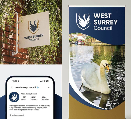
Some examples of the new logo in use.
The council has not ruled out rebranding itself to West Surrey and South Middlesex despite warnings the money would be better spent on services.
The swan has deep ties to Staines and Spelthorne, which both fell under the historic Middlesex borders.
Swan upping is a historic royal tradition on the River Thames, and the bird also features prominently in Spelthorne’s coat of arms. Staines Football Club’s nickname was The Swans and Runnymede Borough Council features swans on its crest.
The new design was agreed today (November 10) at a meeting of West Surrey’s shadow council and will be rolled out gradually – with the majority of existing signs replaced when repaired or updated rather than discarded early.
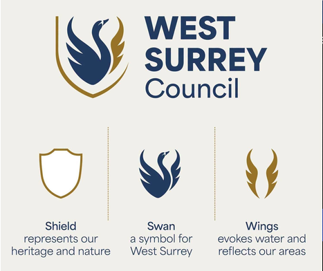
The explanation of the symbols used in the design…
The new badge is the result of feedback from more than 2,500 residents, staff, councillors, businesses and community organisations.
It will initially be displayed where the new council’s identity must be made clear for legal reasons, or are key points of contact for residents, the meeting heard.
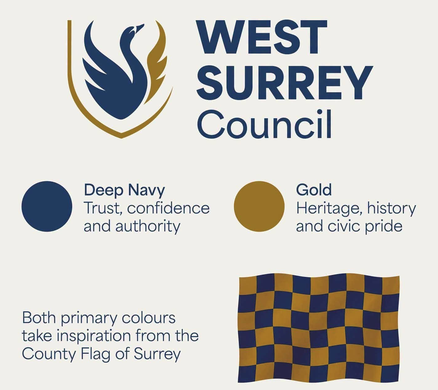
…and of the colour scheme.

Cllr Paul Follows
West Surrey Shadow Council’s leader, Paul Follows (Lib Dem, Godalming South, Milford & Witley), said: “I’m sure this will cause more discussion in the community than almost any item we’ve covered.”
Cllr Follows added: “Whether you get all the deeper meanings of it you can still definitely tell it’s a swan and a shield.”
In an online statement he said: “This has been designed ‘in-house’ with no additional cost to the taxpayer and is essential not just for the identity of the council but to meet a number of legal requirements.
“I appreciate everyone has a design view and nothing is ever perfect, but I think this is a clear and clean design that people will start to recognise.”
The logo is still subject to final tweaks to ensure it is fully accessible to people with dyslexia, for example, or visual impairments.
To change the name the vote would need to be passed by two-thirds majority– but those powers don’t exist during the shadow period and the council would be misrepresenting itself if it were to identify itself by any other name until it passed, officers said.
Following further legal advice, the authority will continue to be referred to as West Surrey Council in its branding and communications.
It can consider changing its legal name after vesting day on April 1 2027, when it becomes a fully constituted local authority.

Cllr Jane Austin
Cllr Jane Austin (Waverley Eastern Villages), leader of the Conservative opposition group at the council, said the new design had improved various iterations and they were happy to give the swan their endorsement “and have it take flight across West Surrey”.
She added: “The cost of doing this is £300,000 and any subsequent change will involve significant cost to our council at a very difficult financial time.
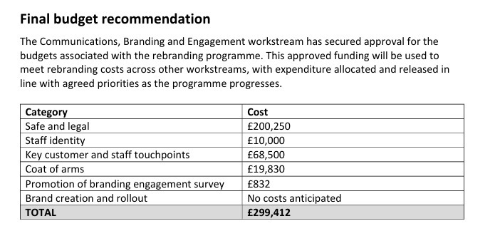
Breakdown of the West Surrey logo budgetary costs – taken from council papers.
“We don’t need to be considering spending money on non-essential items.”
The new West Surrey Council, a unitary authority responsible for all council services, takes full power on April 1st, “vesting day”, and will replace the borough councils of Guildford, Runnymede, Spelthorne, Surrey Heath, Waverley and Woking as well as Surrey County Council.

Surrey will soon be divided into two unitary authorities: East and West Surrey.
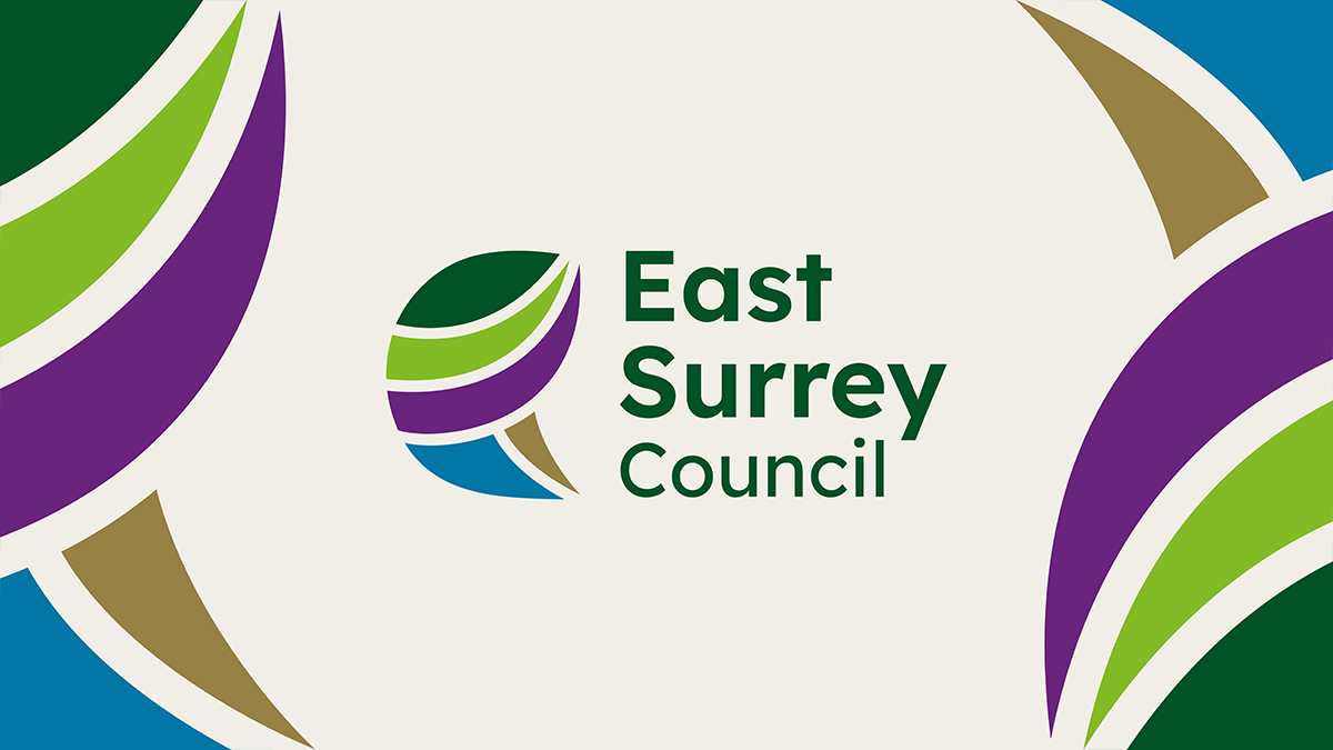
The East Surrey Council logo.
East Surrey will be a separate unitary authority but, subject to the agreement of the two new councils, they will sit under a strategic mayor who will oversee the whole county.
Its logo was announced on October 16.
See: East Surrey’s New Logo Is Announced
Share This Post


Responses to New West Surrey Council Logo Unveiled – Designed ‘In-house’
Leave a Comment Please see our comments policy. All comments are moderated and may take time to appear. Full names, or at least initial and surname, must be given.


"But I was sure that at least Guildford, in Surreyland, would make me an Alderman. Such a nice robe." (Click here to see: Proposed List of Honorary Aldermen Rejected - Cartoon AI assisted.)





Michael Moriarty
November 12, 2026 at 12:28 pm
Frustratingly, I find this actually quite a nice looking logo overall. From a bit of a personal preference I’d drop the shield aspect and keep to just the Swan over the logo text as I think that does enough of a job by itself, but overall it’s quite nice. The only question I’d have is over the Gold colour used, as while it’s close to the Flag of Surrey it is a darker shade than what’s on that flag.
Still though, quite a good job overall especially at the cost. It’s fairly telling that the largest chunk of the cost is getting it through legal checks instead of the actual design though!
David Roberts
November 12, 2026 at 3:56 pm
I agree with Mr Moriarty. Far more inoffensive than the pretentious East Surrey branding.