- Stay Connected
Socialize


 Abraham Lincoln
If given the truth, the people can be depended upon to meet any national crisis...

 Guildford news...
for Guildford people, brought to you by Guildford reporters - Guildford's own news service
East Surrey’s New Logo Is Announced
Published on: 16 Oct, 2026
Updated on: 22 Oct, 2026
 By James Moules
local democracy reporter
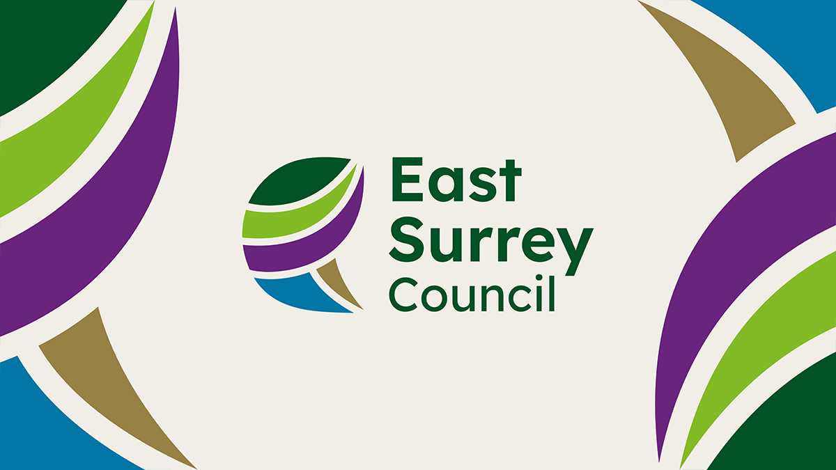
The new East Surrey Council’s logo has been unveiled to the public in the latest big step towards the authority’s creation next spring and West Surrey Council’s logo is to follow soon.
With just under six months to go until Surrey County Council and the county’s 11 district councils are abolished, the two new unitary authorities that will replace them are beginning to take shape.
The West Surrey logo has not yet been made public, probably because it had to await a decision on the council’s name. But asked if the West Surrey logo was being worked on and when it could be expected, Council Leader Paul Follows said: “It is being worked on, and the very last point [at which] it will be determined is Nov 10th but likely earlier. We have the designs anyway.”

Surrey will soon be divided into two unitary authorities East and West Surrey.
The East Surrey logo, which will accompany all official documents and communications for the new council, was crafted following a consultation with residents about what makes the area special.
Cllr Steve Wotton, East Surrey Shadow Authority
It features five shapes that are designed to represent the five boroughs merging to form the new council – which are Elmbridge, Epsom & Ewell, Mole Valley, Reigate & Banstead and Tandridge.
“The logo tells the story of East Surrey,” council leader Steve Wotton (Lib Dem, Horley West, Salfords & Sidlow) explained.
“The five interconnected shapes represent the five areas coming together to create one new council, while reflecting the rivers, countryside and landscapes that connect our communities.
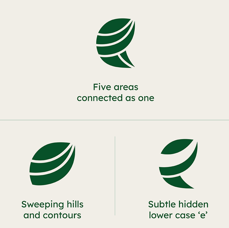 “Just as importantly, it symbolises the relationships between people, places and services that will help make East Surrey Council a strong and connected organisation.”
An East Surrey spokesperson stressed that the logo was designed in-house at no additional cost to taxpayers.
The consultation that led to the design drew more than 2,000 responses among residents, with community, countryside, waterways, and heritage emerging as the strongest themes defining East Surrey.
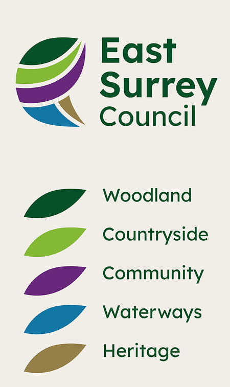 It was the area’s landscape, rivers and countryside that inspired the colour palette featured on the logo.
Cllr Wotton added: “I would like to thank everyone who took the time to share their views and ideas.
“This new identity has been shaped by the people and communities it will serve and reflects the pride people feel in East Surrey.
“My thanks also to our talented in-house designers who have created the new brand using their skills, creativity and local knowledge, making best use of existing resources, without additional cost to taxpayers.”
East Surrey shadow authority’s cabinet has agreed to a phased introduction of the new brand, meaning that existing signage and vehicles bearing the old county and district council logos will not immediately be replaced or repainted.
Instead, they will only be changed to feature the new East Surrey logo as and when they need to be renovated in a bid to save on unnecessary costs.
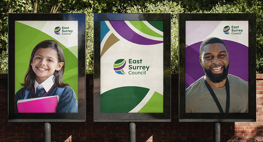
Examples of the logo as it could appear in use.
East and West Surrey councils will formally take over the reins of local government from April 2027, at which point they will be responsible for all services in their respective areas.
Under the current system, this responsibility is split between the county council and various district councils, with Surrey County Council managing services such as education and highways while the districts take care of council tax and planning applications.
Although the government has paused local government restructure for many other similar “two-tier” councils across England, it is still going ahead in Surrey as the process is too far down the line.
Share This Post


Responses to East Surrey’s New Logo Is Announced
Leave a Comment Please see our comments policy. All comments are moderated and may take time to appear. Full names, or at least initial and surname, must be given.

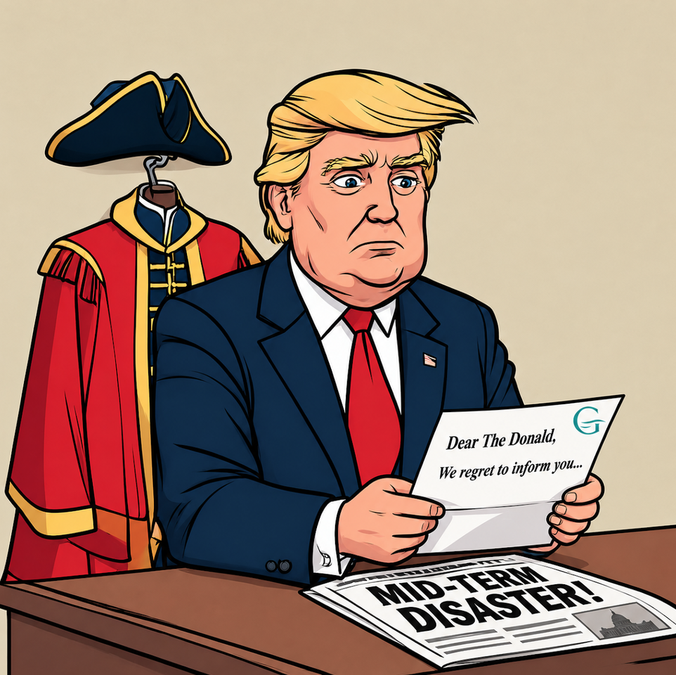
"But I was sure that at least Guildford, in Surreyland, would make me an Alderman. Such a nice robe." (Click here to see: Proposed List of Honorary Aldermen Rejected - Cartoon AI assisted.)





Roger Main
October 16, 2026 at 1:04 pm
Can any one in authority tell me what this pointless reorganisation and redundancy cost are? Does any one know? Does The Dragon NEWS know ?
Editor’s response: Information on the internet apparently sourced from SCC shows the following: “£35.3 million [is given] in the formal business case, though broader initial estimates range up to £60 million or between £76 million and £94 million across wider transition projections.
Bernard Quoroll
October 17, 2026 at 12:15 am
Glad to see it was produced in-house, but it will not have been cost-free. I would be more interested to know what the cost of the whole rebranding exercise will be.
From experience, it will involve much more than a just a new logo. The next thing I expect to hear, is that it will be rolled out on a phased basis to “save money”. Of course the cost would be zero if the powers that be had not embarked on this adventure in the first place. And this is of course money no longer available for service delivery which is under so much pressure. Nor is anyone mentioning the waste involved in writing off such expenditure already incurred by all the former councils. Do the math and I suspect the true figure would cause a sharp intake of breath.
And this is the rub. No one ever looks back properly to understand the true cost of so-called structural reform. Rebranding is just the tiny tip of a very large iceberg or rather two very large icebergs.
Peter Hyde
October 21, 2026 at 12:58 pm
It’s not a rebranding exercise. It’s a new organisation establishing its own identity.
David Roberts
October 23, 2026 at 7:30 pm
There are so many similar-looking logos. I hope East Surrey doesn’t get sued by Roscom Ltd.
I once worked for the government’s overseas trade promotion service which was expensively rebranded as TradePartnersUK. Its logo was a red-and-blue bee with no legs. Sensibly, the name was soon dropped and the logo reverted to the government’s Royal coat of arms in black and white.
One of the firms I promoted was a boutique London branding agency which earned £5 million for reinventing “Swissair” as “Swiss”. Google their logos and see if you can spot the difference!