 Abraham Lincoln
If given the truth, the people can be depended upon to meet any national crisis...
 Guildford news...
for Guildford people, brought to you by Guildford reporters - Guildford's own news service
Letter: Surely We Can Have Better Design Than This?
Published on: 26 Nov, 2016
Updated on: 26 Nov, 2016
From Andrew Backhurst
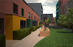
We really need the houses but surely we can do better with the design than this? Something that looks ugly in an artist’s impression will look terrible a few years after it’s built.
In truth, to my eyes, it looks like a Lego city.
Responses to Letter: Surely We Can Have Better Design Than This?
Leave a Comment Cancel reply
Please see our comments policy. All comments are moderated and may take time to appear. Full names, or at least initial and surname, must be given.
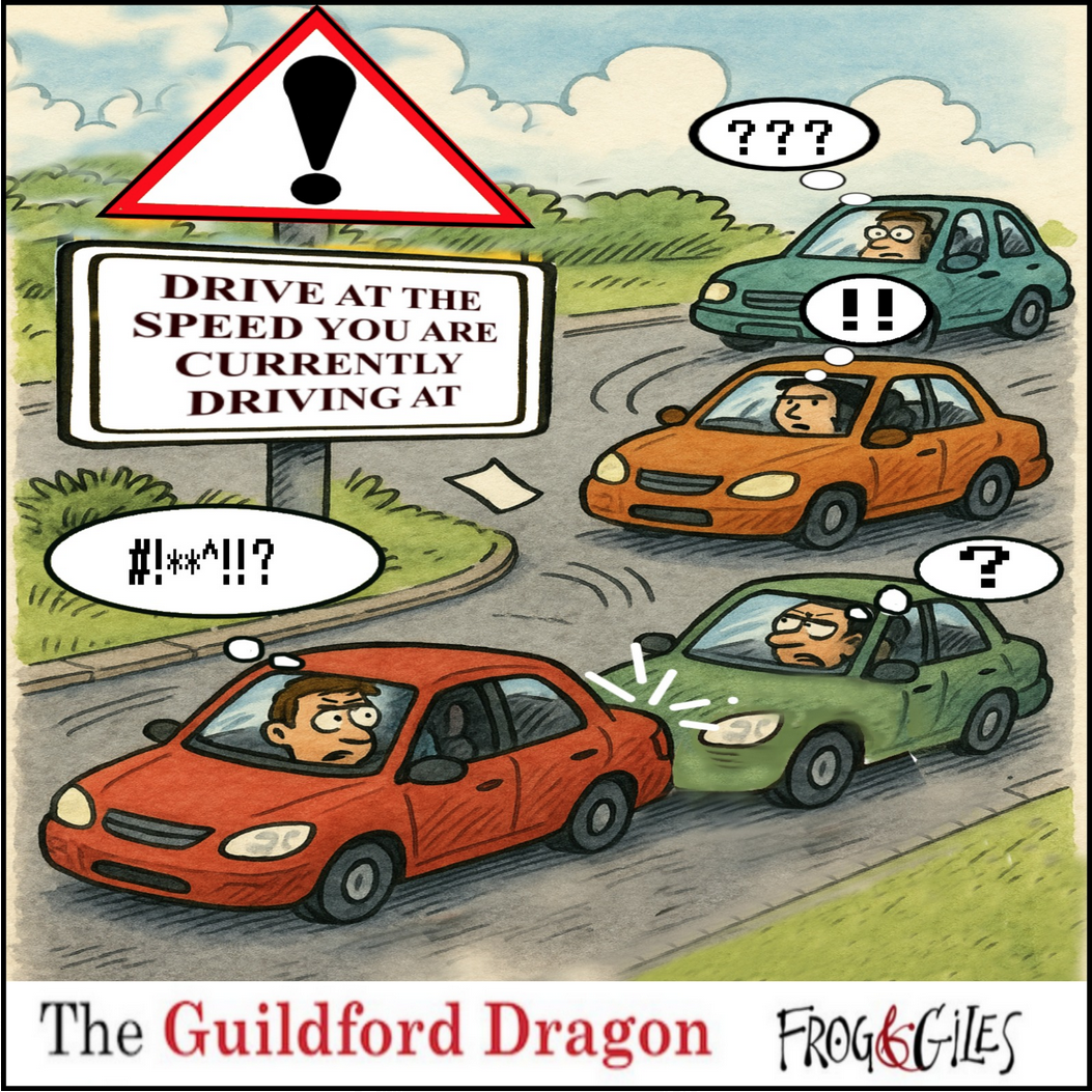
Click on cartoon for Dragon story: Public Asked for Views on SCC’s Proposal for Reduced Speed Limits


Recent Articles
- Wildlife Group Invites Nature Lovers To Spot and Record Threatened Species
- Esme Campbell, Taking the Mantle of the Dragon’s Newest Reporter
- Witness Appeal Following Serious Assault in Guildford
- Notice: Can You Help the University of Surrey Research Elderly Falls?
- Opinion: Waverley Has Failed Spectacularly on CIL
- Highways Bulletin: Smarter Planning for Better Bus Journeys in Surrey
- Letter: Will GBC’s New Planning Document on Building Heights Be Effective?
- Proposed New Leisure Contract Should Improve Facilities and the Council’s Income
- Witness Appeal Following Fatal Collision
- Celebration at Guildford Cathedral of Its Latest and Future Church Leaders


Recent Comments
- George Potter on Letter: A Simple Footbridge Should Have Been Affordable to Keep Towpath Over Weir Open
- John Redpath on Proposed New Leisure Contract Should Improve Facilities and the Council’s Income
- Jan Messinger on Public Asked for Views on SCC’s Proposal for Reduced Speed Limits
- Fiona White on GBC Asks Residents for Views on Its Draft Building Height Guidance
- Dave Middleton on Letter: Fine Those Guilty of Anti Social Behaviour
- Carina Coverly on GBC Asks Residents for Views on Its Draft Building Height Guidance
Search in Site
Media Gallery
Dragon Interview: Local Artist Leaves Her Mark At One of England’s Most Historic Buildings
Dragon Interview: Local Artist Leaves Her Mark At One of England’s Most Historic Buildings
January 21, 2023 / No Comment / Read More
Dragon Interview: Lib Dem Planning Chair: ‘Current Policy Doesn’t Work for Local People’
Dragon Interview: Lib Dem Planning Chair: ‘Current Policy Doesn’t Work for Local People’
January 19, 2023 / No Comment / Read More
A3 Tunnel in Guildford ‘Necessary’ for New Homes, Says Guildford’s MP
A3 Tunnel in Guildford ‘Necessary’ for New Homes, Says Guildford’s MP
January 10, 2023 / No Comment / Read More
‘Madness’ for London Road Scheme to Go Ahead Against ‘Huge Opposition’, Says SCC Leader
‘Madness’ for London Road Scheme to Go Ahead Against ‘Huge Opposition’, Says SCC Leader
January 6, 2023 / No Comment / Read More
Councillor’s Son Starts Campaign for More Consultation on North Street Plan
Councillor’s Son Starts Campaign for More Consultation on North Street Plan
December 30, 2022 / No Comment / Read More
County Council Climbs Down Over London Road Works – Further ‘Engagement’ Period Announced
County Council Climbs Down Over London Road Works – Further ‘Engagement’ Period Announced
December 14, 2022 / No Comment / Read More
Dragon Interview: GBC Reaction to the Government’s Expected Decision to Relax Housing Targets
Dragon Interview: GBC Reaction to the Government’s Expected Decision to Relax Housing Targets
December 7, 2022 / No Comment / Read More
River Wey Breaks Its Banks As Flood Alert Issued
How Can Our Town Centre Businesses Recover? Watch the Shop Front Debate
How Can Our Town Centre Businesses Recover? Watch the Shop Front Debate
May 18, 2020 / No Comment / Read More
Tumbling Bay Weir Repair – Pictorial Report


C Barker
November 26, 2016 at 10:12 pm
So true, just like the eyesores popping up all down Walnut Tree Close.
Caroline Reeves
November 27, 2016 at 8:29 am
A number of the planning conditions that were agreed by the committee cover further decisions on the materials to be used in the construction. The colours are not necessarily a representation of the final design, and computer renderings often don’t do justice to the final build.
Caroline Reeves is the Lib Dem borough councillor for Friary & St Nicolas
Frank Phillipson
November 27, 2016 at 4:28 pm
The design is reminiscent of 1960’s boxes with its rectangular cut-outs for windows. I don’t think that changing the materials will have any great effect. Has this style been selected because it is the cheapest to build with no frills?
Are we at the mercy of what architects and planners think is the current style for new builds of this type? They don’t have to live with it but we’re stuck with it.
There have been many new local buildings with far better architecture than this. Can we not have some pitched roofs, some curves, arches, recesses and projections from the faces of these buildings? Were there any other designs that were put forward for this site?
As an example of how the proposed development will appear you only have to look at the housing development on the north side of Martyr Road (where the old Surrey Advertiser building was) to see how bland and uninteresting it is.